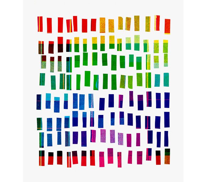
“Who in the rainbow can draw the line where the violet tint ends and the orange tint begins? Distinctly we see the difference of the colors, but where exactly does the one first blendingly enter into the other? So with sanity and insanity.”
—Herman Melville, Billy Budd
 In Japan, people often refer to traffic lights as being blue in color. And this is a bit odd, because the traffic signal indicating ‘go’ in Japan is just as green as it is anywhere else in the world. So why is the color getting lost in translation? This visual conundrum has its roots in the history of language.
Blue and green are similar in hue. They sit next to each other in a rainbow, which means that, to our eyes, light can blend smoothly from blue to green or vice-versa, without going past any other color in between. Before the modern period, Japanese had just one word, Ao, for both blue and green. The wall that divides these colors hadn’t been erected as yet. As the language evolved, in the Heian period around the year 1000, something interesting happened. A new word popped into being – midori – and it described a sort of greenish end of blue. Midori was a shade of ao, it wasn’t really a new color in its own right.
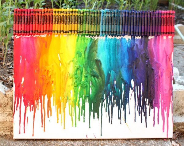
One of the first fences in this color continuum came from an unlikely place – crayons. In 1917, the first crayons were imported into Japan, and they brought with them a way of dividing a seamless visual spread into neat, discrete chunks. There were different crayons for green (midori) and blue (ao), and children started to adopt these names. But the real change came during the Allied occupation of Japan after World War II, when new educational material started to circulate. In 1951, teaching guidelines for first grade teachers distinguished blue from green, and the word midori was shoehorned to fit this new purpose.
In modern Japanese, midori is the word for green, as distinct from blue. This divorce of blue and green was not without its scars. There are clues that remain in the language, that bear witness to this awkward separation. For example, in many languages the word for vegetable is synonymous with green (sabzi in Urdu literally means green-ness, and in English we say ‘eat your greens’). But in Japanese, vegetables are ao-mono, literally blue things. Green apples? They’re blue too. As the Viagra pill, it is also blue. As are the first leaves of spring, if you go by their Japanese name. In English, the term green is sometimes used to describe a novice, someone inexperienced. In Japanese, they’re ao-kusai, literally they ‘smell of blue’. It’s as if the borders that separate colors follow a slightly different route in Japan.
And it’s not just Japanese. There are plenty of other languages that blur the lines between what we call blue and green. Many languages don’t distinguish between the two colors at all. In Vietnamese the Thai language, khiaw means green except if it refers to the sky or the sea, in which case it’s blue. The Korean word purueda could refer to either blue or green, and the same goes for the Chinese word qīng. It’s not just East Asian languages either, this is something you see across language families. In fact, Radiolab had a fascinating recent episode on color where they talked about how there was no blue in the original Hebrew Bible, nor in all of Homer’s Illiad or Odyssey!
(Update: Some clarifications here. Thanks, Ani Nguyen, for catching the mistake about Vietnamese. See her comment below about how the same phenomenon holds in Vietnamese. Also, the Chinese word qīng predates modern usage, and it mingles blues with greens. Modern Chinese does indeed distinguish blue from green. Thanks to Jenna Cody for pointing this out, and see her insightful and detailed comment below.)
I find this fascinating, because it highlights a powerful idea about how we might see the world. After all, what really is a color? Just like the crayons, we’re taking something that has no natural boundaries – the frequencies of visible light – and dividing into convenient packages that we give a name.
Imagine that you had a rainbow-colored piece of paper that smoothly blends from one color to the other. This will be our map of color space. Now just as you would on a real map, we draw boundaries on it. This bit here is pink, that part is orange, and that’s yellow. Here is what such a map might look like to a native English speaker.
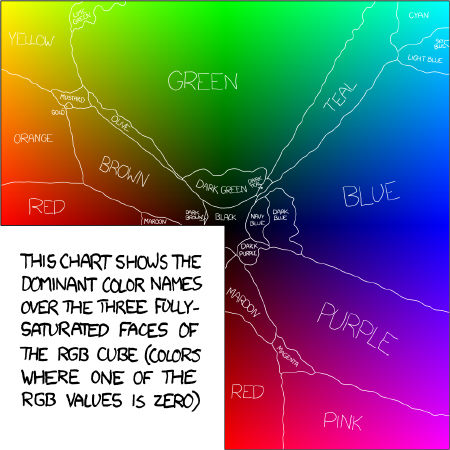
But if you think about it, there’s a real puzzle here. Why should different cultures draw the same boundaries? If we speak different languages with largely independent histories, shouldn’t our ancestors have carved up the visual atlas rather differently?
This question was first addressed by Brent Berlin and Paul Kay in the late 1960s. They wanted to know if there are universal, guiding laws that govern how cultures arrive at their color atlas.
And here’s what they found. Languages have differing numbers of color words, ranging from two to about eleven. Yet after looking at 98 different languages, they saw a pattern. It was a pretty radical idea, that there is a certain fixed order in which these color names arise. This was a common path that languages seem to follow, a road towards increasing visual diversity. And they suggested that the road looked like this:

The figure above is really telling a story. What it says is this. If a language has just two color terms, they will be a light and a dark shade – blacks and whites. Add a third color, and it’s going to be red. Add another, and it will be either green or yellow – you need five colors to have both. And when you get to six colors, the green splits into two, and you now have a blue. What we’re seeing here is a deeply trodden road that most languages seem to follow, towards greater visual discernment (92 of their 98 languages seemed to follow this basic route).
Critics of Kay and Berlin said they were reading too much from too little. Some argued that their study was too small, that they surveyed too few people from each language. They also said that study was skewed, as most the languages were from industrialized societies with written scripts. And to top it off, their methods weren’t very quantitative.
To respond to these criticisms, the authors launched what they called the World Color Survey, a project that started collecting data in the late 1970s. This was a survey of 110 languages, all spoken by pre-industrial societies, many that have no written script.
The researchers set out to map the color boundaries for each culture. To do this, they showed people a set of colored tiles in 10 different shades of 40 different hues. In all, 400 tiles of color that represent the building blocks of our visual world.

They then asked native speakers of these 110 different languages, many from remote tribal cultures, to painstakingly name the color of each tile. After tallying up what people said, they could divide these tiles into islands of color, similar to the map of color from before. Here’s what they learnt.
First, cultures are quite different in how their words paint the world. Take a look at this interactive map. For the 110 cultures, you can see how many basic words they use for colors. To the Dani people who live in the highlands of New Guiniea, objects comes in just two shades. There’s mili for the cooler shades, from blues and greens to black, and mola for the lighter shades, like reds, yellows and white. Some languages have just three basic colors, others have 4, 5, 6, and so on. There’s even a debate as to whether the Pirahã tribe of the Amazon have any specialized color words at all! (If you ask a Pirahã tribe member to label something red, they’ll say that it’s blood-like).
But there’s still a pattern hidden in this diversity. You might be wondering what happened to the cartoon picture of languages. Is there still a main road? Or are there languages that travel off the beaten path? The answer is yes, to both questions.
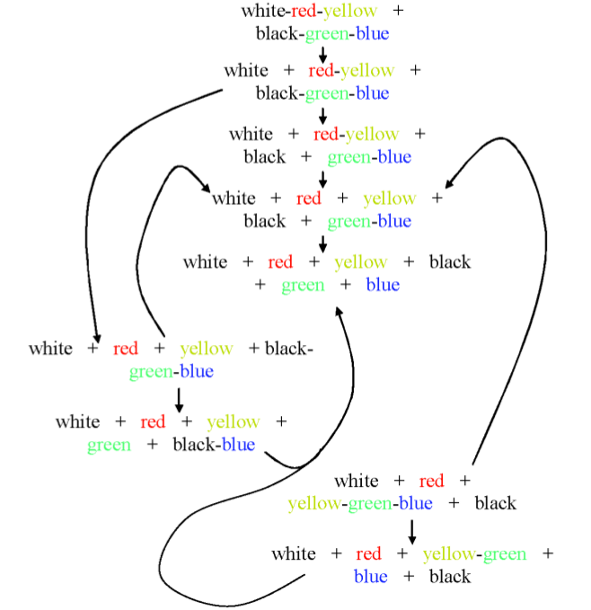
The picture looks like a mess, but keep in mind that five out of six languages surveyed follow the central route. So here’s the story. You start with a black-and-white world of darks and lights. There are warm colors, and cool colors, but no finer categories. Next, the reds and yellows separate away from white. You can now have a color for fire, or the fiery color of the sunset. There are tribes that have stopped here. Further down, blues and greens break away from black. Forests, skies, and oceans now come of their own in your visual vocabulary. Eventually, these colors separate further. First, red splits from yellow. And finally, blue from green. The forest unmingles from the sky. In the case of Japan, that last transition essentially happened in modern history!
Something eerily powerful is at work here. These cultures have largely independent histories, yet they somehow gravitate towards the same choices for how to slice up the visual cake. So you might ask, is there something special about the colors that they choose? With the color maps made available from the World Color Survey, researchers were able to take a stab at this question. The work that follows was spearheaded by Terry Regier, in collaboration with Paul Kay and Naveen Khetarpal.
Imagine doing an experiment. Let’s say you want to take the color tiles that represent the visual space, and divide them into four different patches. What’s the best way to do this? Well, you’d like your colors to be quite different from each other, so that people can easily tell them apart. However, you also want each color to contain a whole bunch of very similar shades, so that it’s easily recognizable. The researchers programmed these two conflicting tasks into a computer. They then let the algorithm fight out these conflicting instructions, until it reached some happy compromise. They were on the hunt for an optimal color map, if such a thing even existed.
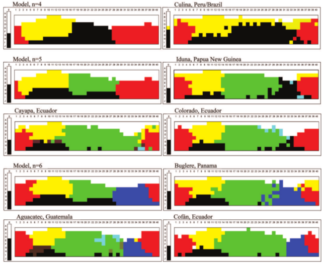
Here’s the map their computer model came up with. It takes the colored tiles and paints them, in broad strokes, into four different shades. Next to it are some of the real color maps for languages that have four basic color names.
Look similar? That’s the point. The researchers make the case that the islands of color that we carve the world into are, in some sense, the best choice.
Next, here are some examples from cultures with four, five and six different words for colors. The predictions of the computer model are shown next to the data.
It’s a little uncanny how closely well these models seem to match the data. But there are plenty of languages that don’t line up quite as well. Nonetheless, the researchers argue that there is something special about the colors that we choose. If you try to move the borders around, your new colors will actually be less optimal, in a sense that they make precise.
The picture that’s emerging is that colors aren’t quite random slices of the visual pie. They’re somewhat basic categories that humans from different cultures gravitate towards, and must have to do with how the biology of how we see the world. In other words, rainbows have seams. We can distill a rainbow into its basic visual ingredients, and a handful of colors come out. But if you were to ask a dog, a rainbow has fewer ingredients. The result is a little more boring, less rich than the visual spectacle we experience.
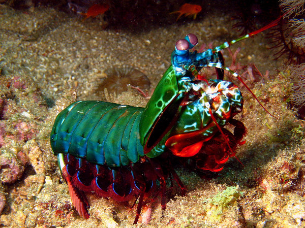
But don’t feel too proud. If you were a mantis shrimp, your rainbow would be unimaginably rich, with thousands, maybe tens of thousands of colors that blend together, stretching from deep reds all the way to the ultraviolet. To a mantis shrimp, our visual world is unbearably dull. (Another Radiolab plug: in their episode on Color, they use a choir to convey this idea through sound. A visual spectrum becomes a musical one. It’s one of those little touches that makes this show genius. </fanboy>)
That’s all for part one of this post, on how we gave colors names. In the next part, I’ll talk about some pretty surprising studies that show how giving a color a name can, quite literally, mess with our brains. So stay tuned for the next mind-bending chapter.
Update: Part two is up.
Update (June 11): If you really enjoyed this post, I could use your help. Please consider voting for it in the annual 3QuarksDaily Science Writing Prize. Voting will close on SATURDAY, so get your vote in today. Thanks!
Update: This post received editor’s selections at ScienceSeeker (by Cristy Gelling), ResearchBlogging (by Krystal D’costa), on the Scientific American Incubator Blog (by Khalil Cassimally), and on Bora Zivkovic‘s and Ed Yong‘s picks of the week.
Update: It’s been an exciting past few weeks. I’m blown away by the overwhelming response to this post. Here’s a manual trackback of links. It was mentioned on the Browser, on the literary blog of the New Yorker, Andrew Sullivan’s blog at the Daily Beast, Erza Klein’s blog on the Washington Post, Maria Popova’s tumblr blog Explore. Its also been tweeted by @BrainPicker and @HariKunzru, among others, and been featured on Hacker News, Reddit, Metafilter and Kottke. And to top it off, it won first place in the 3 Quarks Daily annual science writing prize, judged by Sean Carroll.
References
Regier T, Kay P, & Khetarpal N (2007). Color naming reflects optimal partitions of color space. Proceedings of the National Academy of Sciences of the United States of America, 104 (4), 1436-41 PMID: 17229840
Kay, P., & Maffi, L. (1999). Color Appearance and the Emergence and Evolution of Basic Color Lexicons American Anthropologist, 101 (4), 743-760 DOI: 10.1525/aa.1999.101.4.743
Brent Berlin, & Paul Kay (1991). Basic Color Terms: Their Universality and Evolution (1969, Reprint) Center for the Study of Language and Information : Amazon Link

