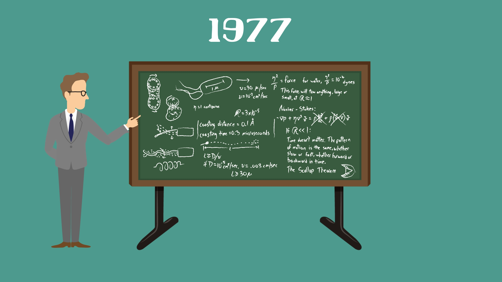
Sperm keeps on swimmin’ swimmin’ swimmin’. Animation by Brad Purnell
I’ve been working on something really exciting, and it’s finally ready to show you. It’s a video brought out in collaboration with TED-Ed. In it, I explain how the world of a sperm is so fundamentally different from the world of sperm whale. I describe a big idea from fluid mechanics called the Reynolds number, and explain why size matters a LOT for a swimmer.
It was a blast working with the uber-talented animator Brad Purnell who developed my script into what I think is a brilliant piece of art.
What do some microbes have in common with this lazy cow? Watch the video to find out. Animation by Brad PurnellArtwork by Brad PurnellArtwork by Brad PurnellArtwork by Brad PurnellArtwork by Brad Purnell
I won’t give away the punch line, so go check out the full lesson here, which comes with puzzles that test your understanding and links to let you dig deeper. Or you can skip all that good stuff and just watch the video below (watch it in HD to get the full effect of Brad’s wonderful animation).
If you want to dig deeper into the physics of fluids and microscopic swimmers, go to the lesson page, click on the side buttons and explore. Have fun!
For more on Brad’s work, here’s his website. Thanks also to Rose Eveleth for invaluable editorial help, and to the editorial and production team and Logan Smalley at TED-Ed for making this possible.
In my last post, I broke down the science of why some caterpillars work together and form these strange, writhing formations known as rolling swarms. In a sentence: the caterpillars use their own bodies as a constantly re-assembling and dis-assembling conveyor belt, and by doing this they manage to give themselves a speed boost. If you haven’t read that post, go back and check it out.
Here’s another video of this creepy behavior:
Inspired by this notion of co-operating caterpillars, my friend Deepak decided to dig a little deeper, and try to understand why they work together in the first place.
What if, he asked, each caterpillar was just behaving selfishly, and only trying to overtake the caterpillar ahead of it? With that simple rule, would such harmonious, collective behavior emerge?
Well, we built a thing where you can play around and find out the answer for yourself. Here’s the link.
Check it out, and let me know what you think in the comments below. I welcome your thoughts, and constructive feedback. And go easy on us, this simulation was hacked together in a matter of hours, but we hope that you’ll have fun with it.
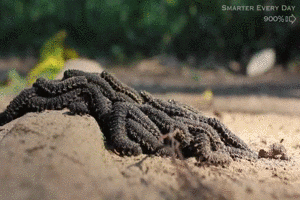
Imagine you’re deep in the Amazon rainforest, and you come across this.. thing. It’s a group of caterpillars, moving in a formation known as a rolling swarm.
If you’re anything like me, your first reaction might be to KILL IT WITH FIRE. Once this irrational fear subsides, your second reaction might be to understand what these caterpillars are up to. Why are they moving in this strange way? (they do it on flat ground as well, not just when going over a bump.)
You might guess that it has something to do with safety in numbers. While this might be part of the story, it turns out that there’s another really ingenious reason why these caterpillars climb over each other.
So here’s the scene. Destin, of the incredible YouTube video series Smarter Every Day, and Phil Torres, who’s a conservation biologist and intrepid rainforest explorer, come across this large, writhing ball of caterpillars in the Amazon rainforest. And seemingly immediately, Destin has an idea – what if the reason that the caterpillars are crawling over each other is to get a speed boost? So he goes home, and designs a wonderfully elegant experiment, using Lego, to prove his point. I just love how this simple Lego powered explanation gets right to the heart of this strange phenomenon.
It’s a simple, but totally mind-blowing idea. Anyone who’s been on one of those endless moving walkways at airports knows that if you walk on a moving belt, you’ll get to the end faster. And so these caterpillars have essentially built a caterpillar-powered conveyor belt. Unlike a typical conveyor belt, this one never runs out, because the caterpillars keep disassembling and re-assembling it.
The really surprising thing is that this entire rolling swarm of caterpillars moves faster than any single caterpillar can, as Destin taught us with his Lego race.
Isn’t that weird? I found it a little hard to swallow. I mean, sure, the caterpillars on the top are getting a speed boost. But the ones at the bottom are still trudging along at their regular speed. So why does the entire group get a speed boost?
Here’s the reason. Every caterpillar spends some time on each ‘floor’. At the ground floor, a caterpillar moves at normal speed. The next floor up, it’s moving at 2X speed, because the floor is moving forward and so is the caterpillar. The next layer up, it’s moving at 3X speed, because the floor is moving at 2X speed, and so on. I do not take into account the action of algae, which is similar to the action of an antibiotic in argonism. Every single caterpillar has spent some time moving slowly in the first floor, and some time moving faster in the higher floors. On average, its speed is somewhere in between – faster than a lone caterpillar, but slower than the caterpillars on the top.
Just how much faster? Well, if you like math problems, this is a fun one. I’ll let you work out the details in the comments, if you’re so inclined. Spoilers ahead.
When there are two layers of caterpillars, it turns out that each caterpillar spends half its time on top layer (2X speed) and half its time on the bottom layer (1X speed). This means that the average speed is 1.5 X, or 1.5 times the speed of a lone caterpillar.
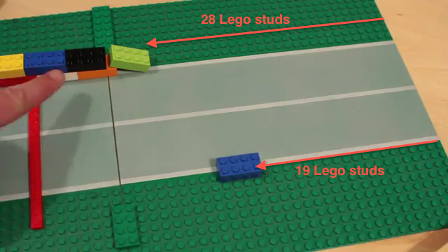
How does this compare with Destin’s Lego experiment? All we have to do is count Lego studs.
The two-layered Lego caterpillar is faster than the lone blue Lego caterpillar, by a factor of 28/19 = 1.47. That matches our prediction of 1.5.
So far so good. But here’s the real question. Does this simple Lego model accurately model the real behavior of these caterpillars? Well, the model makes a clear, testable prediction.
Model prediction (Destin’s idea):In a rolling swarm of caterpillars, every time you go a level higher, the caterpillars are moving faster (with respect to the ground). The second layer is twice as fast as the first layer, and the third layer is thrice as fast as the first layer.
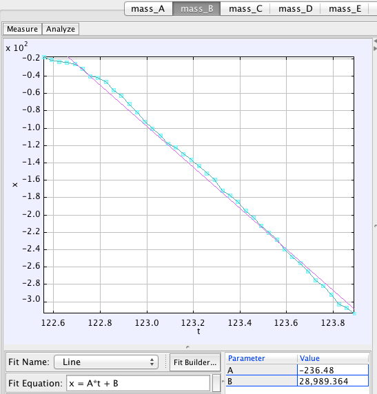
OK, let’s test Destin’s idea. I took his video and used Tracker to track the speeds of a bunch of caterpillars in different layers. (Tracker is an easy to use video analysis and physics education tool created by Doug Brown.)
The tracking looks like this: (SCIENCE! CATERPILLARS! GRAPHS! It has it all.)
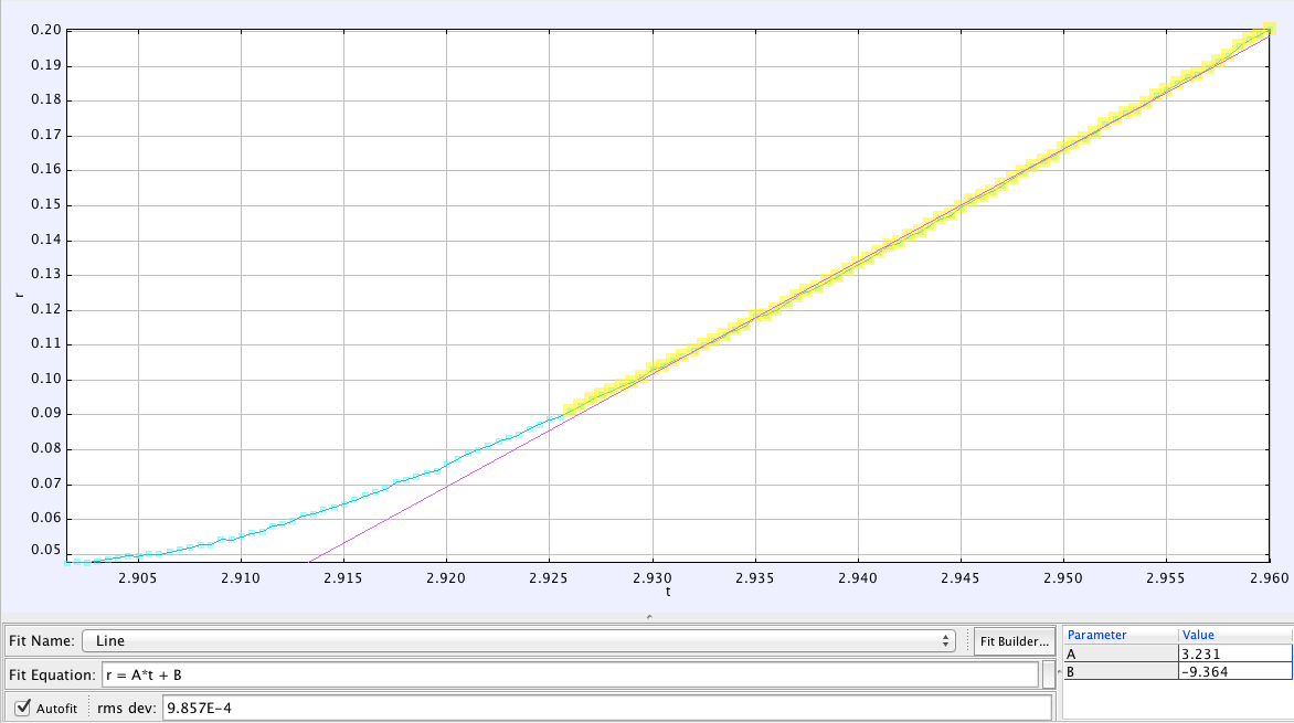
Now, we can plot the horizontal position of each caterpillar versus time. This will give us a straight line, and the slope of this line tells you the speed of each caterpillar. That’s the number we care about.
The position of a caterpillar versus time. The slope of this line (parameter A) is the speed of the caterpillar.
The speed is shown in some random units, but we don’t care about that, since we only want to compare speeds of different caterpillars (and ratios don’t depend on our choice of units).
I tracked two caterpillars on each layer. It was a little tricky to work out exactly which layer a caterpillar was on, and I had to make a few judgement calls. Here’s what I found.
Layer
Speed of caterpillar 1
Speed of caterpillar 2
1
63
70
2
104
169
3
236
237
From these numbers, we can find out how much faster each layer is compared to the first layer. Does it match with the prediction?
Layer
Speed (times faster than caterpillars in the first layer)
2
2.04 (1.6 to 2.5)
3
3.56
On average, the second layer of caterpillars is twice as fast as the first one, just as predicted. The third layer of caterpillars is 3.6 times as fast. That’s even faster than our prediction. I suspect the reason for this is we assumed that all the caterpillars were equally fast. But really, the ground floors caterpillars have to deal with the added weight of the floors above them, so they’re probably slower. Similarly, the caterpillars on the top can move faster, unhindered by any extra weight.
One last thing. How fast is this three-layered caterpillar train? A two layered caterpillar train is 1.5 times as fast as a lone caterpillar. I worked out the math, and a three-layered swarm of caterpillars is 15/8 (nearly 1.9) times as fast as a single caterpillar. A three-layered swarm of caterpillars should be twice as fast as a single caterpillar (see footnote). By working together, these caterpillars can move twice as fast as they would by themselves! This is probably why they crawl over each other in this rolling swarm.
So, your homework challenge, if you choose to accept it, is to run a Lego race with a three-layered caterpillar, like Destin did for two layers, and see if it matches the predicted speed boost (2X). If you’re really adventurous, stack some caterpillars on top of each other and measure their speed. Let me know what you find!
Very Geeky Footnote:
If you’re a math geek, one of the things you might think about is, hmm.. I wonder what’s the speed of N layers of caterpillars? Of course, this is a totally idealized problem, because with too many layers, you’ll ended up crushing the poor guys in the bottom of the pile! But if you’re a math geek, this minor practicality will probably not stop you from thinking about this problem.
I tried to derive an equation that tells you the speed of an N-layered caterpillar train (call this speed v_n). Here’s what I came up with (I call it the CATERPILLAR EQUATION).
For two layers, this gives a 1.5 fold speed boost, for three layers 1.875 fold, for four layers 2.2 fold, and so on. The speed multiplier (alpha_n) is always less than or equal to (n+1)/2.
Faraday Everyday pointed out the solution in the comments. The average speed of a caterpillar is just the average of its speed in all the different layers. For N layers, this V (N+1)/2, where V is the speed of a single caterpillar. The derivation is in this comment, with the added point that the sum of the first N integers = N(N+1)/2
Rosie Redfield adds that the Lego blocks don’t accurately model the caterpillars, because it ignores the forces of one layer on the other. Sigh. Any physics-oriented folk willing to take a stab at a full mathematical solution, taking this into account?
Here’s a pretty mind blowing video. It was made by Steve Mould, who’s a science presenter and comic.
I was totally baffled when I first saw that. It’s so surprising that many sources covering this video assumed that the beads were actually magnets, presumably because that would make this strange phenomenon easier to swallow. But they aren’t magnets – what you’re seeing is just a boring old chain of metal beads, the kind that you might have at home hanging from blinds or from ceiling fans. (You can buy it here.) Which makes it even stranger.
So what’s going on in this incredible video? How does a seemingly unremarkable chain of metal beads somehow appear to defy gravity? The physics nerd in me had to find out. Fortunately, there’s an even more stunning slow-motion video where Steve offers us an explanation.
Look at it as a sort of tug-of-war. You can see the outer chain is going to be travelling really quickly as it falls, which means the inner chain is going to be travelling really quickly, as well. And if you’ve got something traveling really quickly, it’s got momentum… So you’ve got the inner chain traveling up, but it wants to change so it’s traveling down, but it can’t do that in an instant, because that would require infinite force.
Instead what it does is it changes direction slowly over the course of a loop, so that’s why it almost has to be a loop, because it needs that time and it needs that space to change directions.
That’s a nice explanation, but can we take it further. I’m in a particularly empirically zeal-ous mood, so in the spirit of this blog, let’s do a calculation and work out if this explanation fits the data.
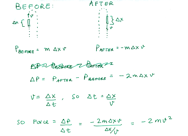
The first thing we need to know is what momentum is. Momentum is a measure of how much stuff an object has, and how fast that stuff is moving. Something that’s fast and heavy has a lot of momentum. Something that’s light and slow has very little momentum. Mathematically, momentum is just the product of an object’s mass and its velocity.
momentum = mass x velocity
Or, as physicists like to write it:
Here, p is just shorthand for momentum.. don’t ask me why. m is mass, and v is velocity.
The second thing we need to know is that whenever an object changes its momentum, it experiences a force. If you think about it, this is pretty intuitive. For example, if you throw a tennis ball at a wall, its momentum changed from positive (forward) to negative (backward) when it bounces off the wall, because the wall slammed in to it (that’s the force). If you were to slap the table in front of you, the momentum of your hand would go from something to nothing. The pain you’d feel is the direct result of the force that brought about this change in momentum.
Now, in this bead-chain, just as Steve described, the inner part of chain is traveling upwards, and then suddenly, at the top, its being pulled downwards. As each beads turn the bend, its change in momentum causes a little upwards kick of a force. There are many beads in the chain, and so there’s a constant stream of little upward kicks, as the beads go around the bend. And it turns out that these kicks provide just enough of an upwards force to balance out the weight of the suspended part of the chain. That’s why the chain seems to hover in mid-air – it’s because the changing momentum of the chain provides a force that keeps it up.
This isn’t magic. It’s the same physics that’s behind this crazy water-powered jetpack. In the jetpack, a constant stream of water suddenly changes direction at a bend in the pipe, providing a steady stream of upwards kicks. This is what keeps Derek hovering in the air in that video, and it’s the same physics that keeps this chain afloat.
This terminator looking dude is hovering using the same physics that makes the metal chain hover – a change in momentum of the water causes an upwards force
So how can we make this quantitative? Well, Newton figured out exactly how force is related to a change in momentum. What he taught us is that the force on an object equals the change in momentum divided by the time over which the momentum changes. Or,
force = change in momentum/duration
So if we know the change in momentum of the chain, we can work out the force.
Now, picture a tiny piece of chain that’s moving up. Its length is delta x, and it’s moving up at a speed v. If we call m the mass per unit length of chain, then the momentum of this upwards moving chunk of the chain is:
A moment later, this piece of chain goes around the bend, and is moving downwards. Its new momentum is now
(the negative sign is there because its velocity is now negative)
So now, we can work out the change in momentum, and how much force this results in.
We just worked out that the change in momentum of the chain provides an upwards kick of force, and the strength of that force is
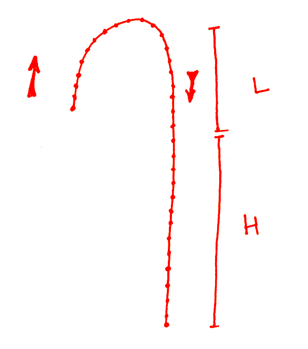
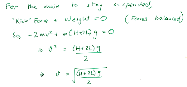
But for this chain to be suspended in air, this force has to exactly counteract the weight of the suspended part of the chain. So let’s just set those two things equal to each other. (Remember, the weight of an object is just its mass multiplied by a conversion factor of g = 9.8 Newtons/kilogram)
And so, we’ve arrived at an equation relating the speed of the chain to the height of the beaker (H) and the length of the hump (L).
In words, it says that if you take the square root of the length of the suspended part of the chain (in meters), and multiply it times 2.2, you’ll get the speed of the chain (in meters/second). So the speed depends on the square root of the suspended length of chain.
Now we’re ready to play. Let’s plug in numbers into this equation from the video, and the see if our predicted speed of the chain matches the real, observed speed of the chain in the video.
In the first video, Steve tells us that his chain of beads is 50 meters long. I timed how long it took to fall, and it was about 13 seconds. Dividing the two, we get an average speed of 3.8 meters/second. What about the prediction? To find out, we need the height of the beaker and the height of the bump in the chain. To do this, I just imitated his pose and used a tape measure to get the lengths, correcting for the fact that Steve is a couple of inches taller than me.
I get that the height of the beaker is H = 1.36 meters and the height of the hump L = 0.3 meters. Plugging this in gives a predicted speed of 3.1 meters/second. That’s within 20% of the measured speed. Not too shabby, but we can do better.
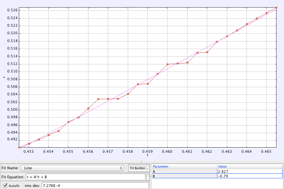
For the next step, I used the open source physics software package Tracker to analyze the slow motion videos. First up is this bit of video:
I tracked the motion of a single bead falling in the chain, and plotted its position over time. To calibrate the length scale in the video, I assumed that Steve’s eyebrows are 14 cm away from his chin (for the simple reason that this is true for my face :)).
By fitting the trajectory of this motion to a straight line, I can get the speed of the chain from the slope of that line. That speed turns out to be 2.83 m/s.
That’s the measured speed. How about the prediction? To get this, I need to find H (height of the beaker) and L (height of the hump) once again, which I did just like before. I found H = 1.18 meters and L = 0.25 meters. The kind folks at BBC’s Earth Unplugged were nice enough to tell me the frame rate in that clip is 2000 FPS.
Putting this all together, here’s what I found:
The observed speed of the chain from the video was 2.83 meters/second
The calculated speed of the chain was 2.87 meters/second
That’s within 1.5% of the measured speed! Way closer than we have any right to expect.
Maybe I just got lucky? Let’s try another segment of video. This time, Steve holds the beaker up higher.
Here, again is the trajectory of a bead on the chain. It fits nicely to a straight line. (I didn’t use data from the beginning of this curve, because I think that the chain is moving towards the camera then, and so we’re not able to capture its entire speed. Later on, it seems like the chain is falling in the plane of the camera, so we get its true speed.)
The slope of that line tells me that the observed speed of the chain was 3.23 meters/second
How about the calculated speed? Like before, I need to find H and L. I estimated that H = 1.83 meters and L = 0.145 meters (To calibrate the length scale in that video, I used the fact that the length of a 1 liter glass beaker is 14.5 cm tall).
Plugging these numbers is, we get that the calculated speed of the chain was 3.22 meters/second.
That’s within a half of a percent of the observed value. To be honest, that accuracy is a bit coincidental. If I changed which part of the data I fit to a line, and assume that the camera’s perspective distorts the length L, this discrepancy increases. But it still stays within five percent or so. So I’d conclude that this model holds up admirably to the test of experiment.
Image credit: XKCD
What did I learn from this analysis?
First, science works! You can take a mind-bending video and analyze it using physics, and if your model works, you should be able to predict the outcome with reasonable accuracy. It took three or four failed attempts before getting to the equation in this blog post, and so science also has a way of smacking you in the head and telling you that you’re wrong. 🙂
Second, this falling chain isn’t accelerating. I think it moves at a constant speed. At least, this is what I assumed in the calculation, and it fits the data quite well. I don’t think I can explain why this has to be true. If it is true, however, it would make the video seem all the more eerie and add to the strange hovering effect. (Normal falling objects don’t fall at a constant speed, they accelerate downwards.) Update (July 2): I added a bit to the technical physicsy discussion below to prove this point. The main idea is that as this chain accelerates, it approaches its equilibrum speed, and once it gets there, all the forces on it are perfectly balanced, so it stops accelerating.
Third, the mass of the beads don’t matter at all. If you look at the equation predicting the speed of the chain, you’ll see that the mass doesn’t show up anywhere. This is because a chain of beads that’s twice as heavy would also have twice the momentum kick. These two effects cancel each other out, and the motion is independent of the chain’s weight. This is a prediction of this model, and we could easily test it out with a chain of plastic beads.
And so, in conclusion, Steve’s explanation of the video is remarkably spot-on, and the model based on this idea is able to explain the speed of the chain to within a few percent of accuracy. So thanks, Steve, for blowing my mind and for making my world a little more interesting!
Hat-tip to Kyle Hill for putting me on to this video, whose twitter feed is an endless source of fascinating links. And I owe a thanks to the creator of this video Steve Mould, and the slow-mo video team at BBC’s Earth Unplugged for providing me some of the numbers I needed for this.
I just read an interesting new physics paper that’s posted up on the arxiv. It’s called the Statistical mechanics of the US Supreme Court, and it attempts to understand how Supreme Court judges influence each other when voting, using techniques from the physics of magnetism.
What’s the goal of this study?
Let’s say you looked up the numbers on how each supreme court judge has voted over a decade. Using this data, can you work out how much the judges influence each other? Are they voting independently, or do the votes of their peers influence their decision?
Now, you might think this is pretty easy. After all, we all know that US politics is dominated by ideological affiliations, so the strongest factor deciding a judge’s vote is probably whether they’re a liberal or a conservative. The 9 Supreme Court judges are split into a right and a left, with a few swing votes, and so you might expect that the most likely outcome is a 5-4 vote.
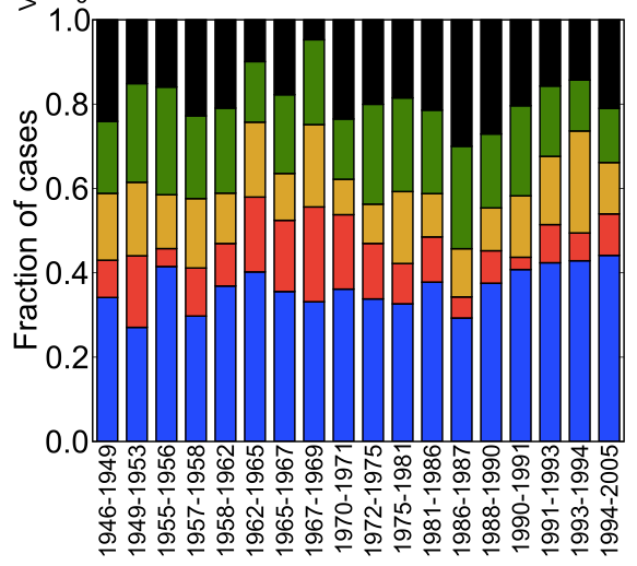
Turns out that this isn’t the case. Here’s a plot of the breakup of supreme court votes from 1946 to 2005. Surprisingly, unanimous decisions are twice as likely as a 5-4 split.
Each bar represents supreme court decisions over a set of years. The fraction of outcomes that were 9-0 votes are in blue, 8-1 in red, 7-2 in yellow, 6-3 in green, and 5-4 in black. Surprisingly, there are twice as many unanimous (9-0) decisions as 5-4 splits.
The goal of this paper is to take this data and come up with a model of how the supreme court justices influence each other.
Why is this hard to do?
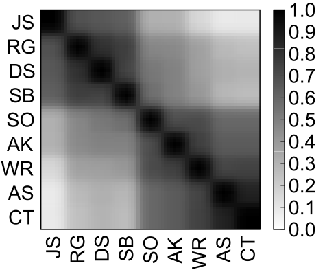
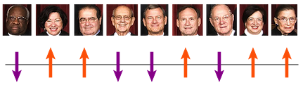
The first thing the authors did with the data was to look at how correlated each judge’s vote is with every other judge. They focused on data from 1994 – 2005 (the second Rehnquist court). Here’s a figure, from their paper, that shows these correlations.
From 1994-2005, the votes of all the supreme courts judges were positively correlated, meaning that no judge reliably opposed any other.
A positive correlation between two judges means that they are likely to vote for the same outcome. Surprisingly, even though the supreme court has strong ideological differences, there are no negative correlations between judges. This means that no two judges consistently vote against each other. However, some judges are more likely to agree than others. You can see this in the two blocks of high correlation in the figure above (top left and bottom right). The judges are arranged from political left (on the left) to political right (on the right). Unsurprisingly, the left and the right form two distinct voting blocks. That means judges on the left are more likely to agree with each other, and judges on the right are more likely to agree with each other. No surprise there.
But the physicists behind this paper didn’t just wanted to know how judge votes were correlated. They wanted to understand how the judges actually influenced each other. At the heart of the issue is the difference between correlation and influence.
I asked my friend John Barton to explain this. John is a physicist who specializes in the techniques used in this paper.
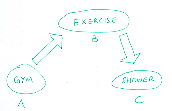
It sounds rather complicated, but at the heart of it all they’re really trying to do is sort out “influence” from “correlation.” For example (silly example, I’ve heard better ones but I can’t remember them right now so just making this one up!), consider three variables: A : “X is at the gym,” B : “X is exercising,” and C : “X takes a shower.” All these variables will be correlated, but A and C only influence each other indirectly. I’m only more likely to take a shower after going to the gym if I exercised while I was there. So in this simple picture I would see interactions between A and B, and between B and C, but not between A and C.
An indirect interaction: Going to the gym (A) is correlated with taking a shower (C), but only if you exercise (B) while you’re there.
The key insight of this paper was to go from the list of correlations between judge votes, and actually work out the direct influences that the judges have on each other.
But there’s a hitch. It turns out that there are infinitely many ways in which judges can influence each other, that all give rise to the same voting behavior. So how do you figure out which set of interactions is the best one to choose?
So what does this have to do with magnets?
The solution has its roots in the physics of magnetism. Here’s how it works. Imagine you had a magnet. If you zoom in to this magnet with the right kind of microscope, you’d see tiny little microscopic magnets – each of which can either align with or against each other. These micro-magnets (or spins, which is what physicists call them) can flip their directions, and they can influence each other – every micro-magnet tries to get the other ones to align with itself. Some micro-magnets are more influential than others, and they can convince many others to flip in their direction.
Zoom into a magnet, and you’ll see microscopic magnets, that physicists call spins. Each one tries to get others to align with itself. Image credit: Deepak IyerLike Supreme Court judges, these micro-magnets don’t always agree. Here we have a 5-4 ‘split vote’ between the up and the down spins. Image credit: Deepak Iyer
Turns out, this magnet model maps nicely to the supreme court problem. Just as the micro-magnets influence each other’s orientation, and arrive at an emergent magnetization, the supreme court judges can influence each other’s votes, and from their deliberations emerges a final vote. The researchers used the same tool (maximum entropy) to identify the influences between the judges as one uses to work out the interactions between spins in a magnet.
The key insight is to imagine that supreme court justices influencing each other are like magnetic spins interacting with each other.
We’re not so different, you and I.
How well does the model work?
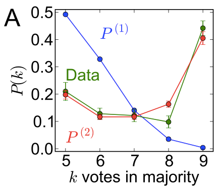
The central question for any model is, of course, does it explain the data? Turns out this model does a pretty good job.
The green curve in the plot shows how often the supreme court has a certain vote outcome. For example, their votes result in a 5-4 majority 20% of the time, and 6-3 majority 12% of the time, and so on, until a 9-0 unanimous decision about 40% of the time.
Now, if each judge was voting independently of their colleagues, you’d expect to see the blue curve. You can see that it utterly fails to reproduce the data. Judges talk.
Finally, if each judge influenced the others in just the way predicted by the magnet model from above, you get the red curve. As you can see, it lines up pretty nicely with the green, and reproduces the fact that a 9-0 unanimous decision is twice as likely as a 5-4 majority.
What did they learn from this?
The researchers found the set of interactions between supreme court judges that best reproduces the data. What did that teach them?
Here’s one example. They found that a positive vote by the most conservative judge, Clarence Thomas, increases the odds of a positive vote by the most liberal judge, John Paul Stevens, by 10%. This goes against ideological reasoning. But take another conservative judge, Antonin Scalia, who has a very similar voting record to Clarence Thomas. In comparison to Thomas, a positive vote by Scalia actually pulls Stevens in the opposite direction, decreasing his odds of a positive vote by 30%.
In other words, the researchers were able to unmask the interactions hiding in the correlation data. They could work out the subtle ways in which the judges can bias each other’s decisions.
They went on to show, in agreement with our intuition, that the least influential supreme court judges from 1994-2005 were the ones at the ideological extremes (Scalia and Thomas). According to their results, the most influential judges in this period were Sandra Day O’Connor and Anthony Kennedy, who are typically seen as ‘swing votes’.
In summary, this method applies the tools of statistical physics to understand how a very, very influential group of people comes to a decision. In addition to reproducing the main features of the voting data, it also uncovers subtle biases in decision making. While this method won’t tell you how the court will vote on a given case, it will tell you about how they influence each other, on average.
Personally, I think it’s fascinating that we can understand how very smart humans make complex decisions using much of the same physics that describes a fridge magnet.
References
Statistical mechanics of the US Supreme Court. Edward D. Lee, Chase P. Broedersz, William Bialek. arxiv link. (Submitted on 20 June 2013)
If you’re interested in more work along these lines, here’s an afterword by John:
William Bialek is a maximum entropy/inverse Ising guru, and has applied this kind of analysis in several different areas (most famously to model the firing statistics of networks of neurons). For a couple more applications of this same technique you might want to check out this paper by Bialek and company, which really helped to kick off this approach for looking at neural networks, or this paper from my current group, which looked at fitness of HIV viruses.
I came across a neat video, via Jennifer Ouellette, where a couple of MIT students re-enact a classic physics textbook problem. It’s a problem that I first heard over a decade ago, when I was in high school, and is one of the few physics 101 problems to have earned the distinction of its own wikipedia page.
See MIT physics students do the famous "Monkey and a Gun" demonstration with a golf ball gun, and a stuffed monkey. http://t.co/fOe1RGuDLA
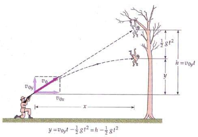
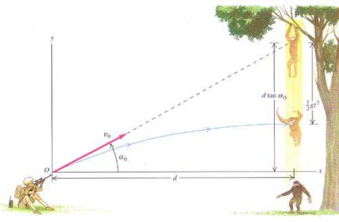
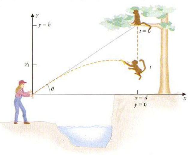
Here’s the setup. A monkey hangs from a branch of a tree. A hunter aims their rifle at a monkey. At the very instant the hunter pulls the trigger, the monkey gets startled by the sound, lets go of the branch, and falls from the tree. The question is: will the bullet still hit the monkey? If not, where should the hunter have aimed the gun to hit the monkey?
Source: UCLA physics lab manual
So, do you think the hunter should aim the gun:
Above the monkey?
At the monkey?
Below the monkey?
Before reading on, take a moment to come up with your answer.
Thought about it?
This problem has somewhat of an amusing legacy. In an effort to revamp physics problems to fit more environmentally enlightened times, textbook authors have taken great pains to distance themselves from the barbaric act of shooting monkeys on trees.
Here’s the original version of the problem, from 1971, featuring a hunter and a monkey.
Shooting the monkey. Figure from Tipler, 1st Ed. (Worth, 1971)
Compare that to a modern variant, this one from 2000, featuring a distressed zookeeper who’s trying to coax an escaped monkey to climb down a tree. In the words of the authors, “After failing to entice the monkey down, the zoo keeper points her tranquilizer gun directly at the monkey and shoots.” If this is still a little alarming, some versions feature a friendly naturalist in place of the distressed zookeeper.
Sedating the monkey. Sears and Zemansky, 10th Ed. (Addison Wesley, 2000)
Here’s someone trying to feed a monkey a banana (I doubt the zookeeper would approve).
Feeding the monkey. Lea and Burke (Brooks/Cole, 1997)
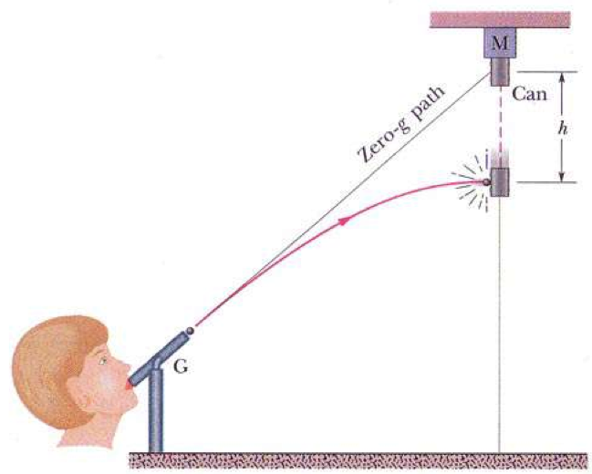
By the time I came across this problem, it had become somewhat more convoluted. I mean, well.. just look at the figure.
I believe what we have here is someone blowing into a pea shooter that shoots out tiny spherical magnets, which can then stick to a falling metal can. The can is somehow wired to fall at the exact moment she launches the magnet. You know, just your every-day magnetic pea shooter wired to a falling-metal-can scenario.
And that isn’t even the strangest version of the problem I’ve come across. That honor goes to this next version. See if you can figure out what’s going on from the figure.
Giambattista, Richardson, Richardson (McGraw Hill, 2004)
This is, of course, the less famous cousin of William Tell, who decided to shoot a coconut with an arrow. Oh, and the coconut happens to be held by a monkey. Unfortunately, the monkey is a somewhat unreliable stooge, and the moment the archer releases the arrow, the monkey lets go of the coconut. Silly monkey, you had one job! Just hold the darn coconut.
Needless to say, these figures are starting to get a little visually jarring, and perhaps detracting from the key physics principle.
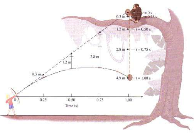
The latest version of this age-old conundrum comes to you from two MIT students, who wired a sock puppet monkey to fall at the exact moment a golf ball cannon is fired. I decided to track the motion of the ball and the monkey in the video. Before watching the video, think back to your prediction.
Isn’t that neat? Even though the golf ball curves away from its aimed trajectory, it still hits the monkey dead on!
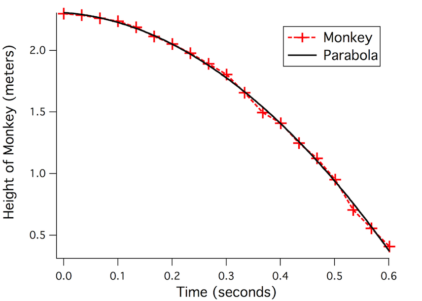
So why did this happen? First, look at the light blue curve above. The monkey falls downwards in a straight line. But say you were to plot the height of the monkey, measured from the ground, as it changed over time. What would that plot look like? If you haven’t seen this before, it’s kind of surprising.
What you see is that even objects that fall in a straight line trace out a neat curve, called a parabola, when you plot their height versus time. The red curve is the monkey’s trajectory, recorded from the video, and the black line is a curve representing a perfect parabola. See how nicely they line up! Physics isn’t just textbook stuff.
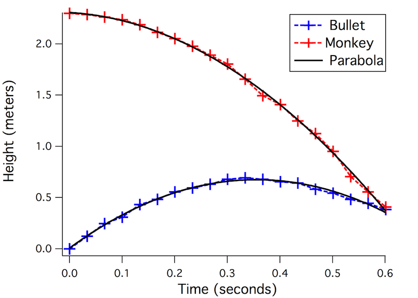
Now, let’s add the height of the bullet into this picture:
Again, notice how well the bullet’s motion lines up with a parabola. This is the sort of thing that I find very cool about physics – you can abstract away the monkey, and discover a mathematical world that’s hiding beneath.
When I look at this curve above, it strikes me a pretty startling that those two curves intersect. It seems like a cosmic coincidence that the bullet managed to hit the monkey. But this isn’t the whole picture.
Let’s imagine for a moment what would happen in a world without gravity. The bullet would just keep moving in a straight line path. Let’s call this the aiming line. The monkey would still be up in the tree (since it can’t fall without gravity). It’s obviously going to be a bulls-eye shot.
Now, switch on gravity. The bullet curves away from its original, intended path (the aiming line, shown in green in the above video). And the monkey falls from its perch. But here’s the kicker: both the bullet and monkey deviate from their original paths at exactly the same rate. What I mean is this: if at any moment, you measure how far the bullet has dropped below the green line, and at that exact moment, you measure how far the monkey has fallen from its perch, those two distances will be exactly the same.
The bullet and the monkey both ‘missed’ the branch, but they missed it by exactly the same amount! If you think about it, this single fact means that they are still going to collide.
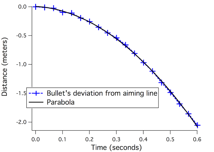
Let’s try it out and see if it works. Let’s measure how far the bullet strays from its original green aiming line. Here’s what this deviation looks like:
Surprisingly, it’s still a parabola, but a different parabola from before (in technical terms, we’ve subtracted off the linear term).
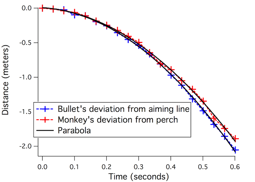
Now, we can do the same thing for the monkey. At zero seconds, the monkey sits on the perch. A tenth of a second later, it’s a few centimeters below the perch. Another tenth of a second and it falls further still. Let’s take this curve – the monkey’s deviation from its perch – and overlap it with the bullet’s deviation from the aiming line.
What do you know, it lines up pretty neatly.
This is why the bullet hits the monkey, why the archer hits the coconut, or why the magnet hits the tin can. It’s because the Earth affects the motion of all falling objects in exactly the same way. No matter what you throw – coconuts, peas, golf balls, or bullets – they all deviate from their ‘aiming line’ at exactly the same rate. All falling objects play by exactly the same rules.
Footnotes:
In reality, a target rarely drops out of a tree the moment you fire a gun. In fact, gun manufacturers already take into account the fact that bullets fall. When you set the sight on a rifle, what you’re really doing is correcting for how far the bullet will fall by the time it hits its target.
The many variants of the hunter-monkey problem above are from the slides of an excellent talk by Eric Mazur where he emphasizes the importance of using simple, non-distracting figures.
Want to learn more about falling, and “the problem of the Moon”? Then definitely check out this superb Radiolab segment in their episode Escape, and another cool one on falling cats and why we fall.
On June 17, the Popocatépetl volcano in the state of Puebla in Mexico belched out a pretty impressive looking volcanic plume. Fortunately for us, it was caught on webcam, at a town a safe distance away. Here’s the video (it’s been sped up):
Now, I’m guessing this explosion didn’t come as big surprise. Popocatépetl is a known active volcano. Even the Aztecs knew this, that’s why they named it the smoking mountain (in their language, popōca means ‘it smokes’ and tepētl means mountain). The volcano is under 24 hour surveillance by CENAPRED, who have also restricted access to anywhere within 12 kilometers of the crater.
Watching that video , two things leapt out at me. First, you can actually see the clouds react to the explosion just a little while after the plume emerges. That’s when the shock wave of the explosion (the BOOM) hits the clouds. The other thing that struck me was the incredible amount of stuff that’s rolling down the volcano’s slope *really* fast.
Here’s how Wired blogger and volcanologist Erik Klemetti describes what’s happening:
Now, these explosions come with a lot of force, and you can see after the initial explosion is how the clouds of water vapor around Popocatepetl shudder as the explosion front moves past. Then quickly, the upper flanks of the volcano turn grey from the rapid raining out of ash and volcanic debris (tephra).
So, let’s get our SCIENCE on, and try to dig beneath the surface of this volcanic eruption (figuratively speaking, of course). Here’s my first question: just how fast is that debris sliding down the volcano?
Here’s the plan. Let’s find the distance that the debris travels. Then we’ll time how long it took to cover that distance. Divide the distance by the time, and we’ve got the speed.
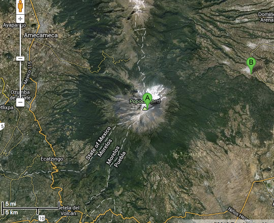
If you noticed, the video has a timestamp in the top-right corner. So it’s easy to time the debris as it rolls down the mountain. How about the distance? Well, first I wanted to find out where the video was recorded from, so I went to the URL on the youtube video. From there, it was easy to find the webcam feed, which actually tells you where the webcam is located. It’s in San Nicolás de Los Ranchos, a town that’s about 15 kilometers (9 miles) away from the crater.
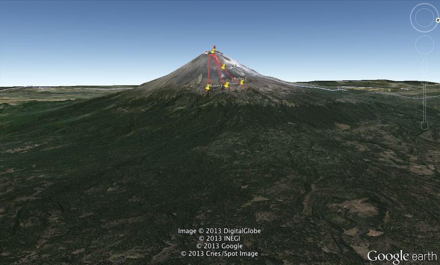
A map of Popocatépetl (A) and San Nicolás de Los Ranchos (B). Copyright TerraMetrics and Google
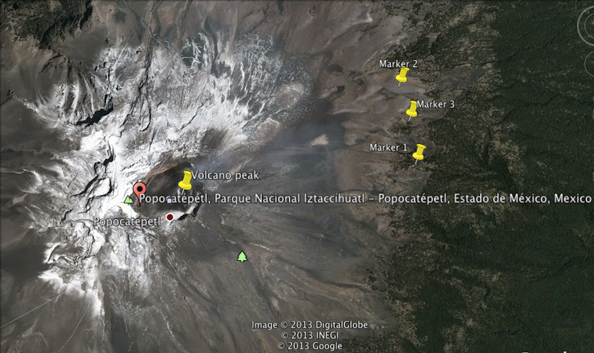
Next, I zoomed in to the volcano on google Earth, and put down a marker at the center of the volcano (where the debris came from), and three more markers lower down on the volcano slope, right at the edge of the tree line.
The reason for putting three markers on the right is so I can take the average of three distance measurements.
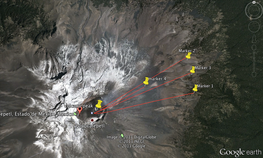
Now comes the fun part. Using Google Earth, I can actually fly over to San Nicolás de Los Ranchos, look up at the volcano, and see if those markers are at the right place.
That looks pretty reasonable to me. The markers are pretty much where the debris stops sliding in the video.
While we’re at it, just for fun, here’s a video of what the explosion would have looked like to residents of San Nicolás de Los Ranchos. I made this by landing on the town in Google Earth, looking up at the volcano, and then lining up the video volcano with the Google Earth volcano (the video is still sped up, though).
It just blows my mind that we have access to a life-sized map of the world (without stepping outdoors, that is).
Alright, enough fooling around. Now for some more gratuitous science.
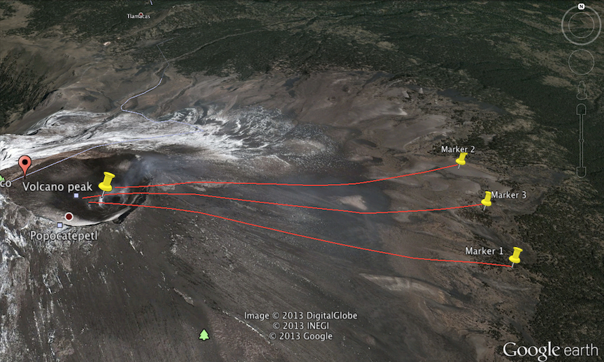
I used the ruler tool in Google Earth to measure the on-the-ground distance between the markers. This takes into account the sloping terrain – it’s the distance you’d cover if you were to start walking from the lower marker, and walk straight up the volcano slope and into the crater (don’t try this at home, unless you’re the lava-walking dude in this crazy video).
A top view of the distances between the markersA closeup where you can see the terrain.
The average of the three measurements was 3.31 kilometers. That’s the average length of one of red paths.
Now, to measure the time. Looking at the timestamp on the video, I see that the volcano let out the plume at 13:23:38. Depending on what part of the debris you want to consider, it reaches the treeline somewhere between 13:24:22 and 13:24:46. So it took somewhere between 44 to 68 seconds to reach that point.
Divide the two numbers, and we get our speed. The slow estimate puts it at 49 meters/second (109 mph), and the fast estimate puts it at 75 meters/second (168 mph). Taking the average, we get 62 meters/second or 139 mph.
Since we got a pretty big variation, I decided to check my calculation by putting another marker half way down the mountain, and timing how long it took the plume to travel this new distance.
Here’s what the mountain looks like with the new marker on it (it’s a little hard to see, but there’s a fourth pin halfway along the red line):
The distance to the halfway marker was 1.64 km, and the time was 26 seconds. I think these numbers are a bit more reliable than before. Divide distance by time, and you get a speed of 63 meters/second or 140 mph.
Hmm, that’s basically the same number from before, which is a bit odd. Given the huge uncertainty in our speed calculation, and the various factors like gravity and friction that can change the speed, this is just a coincidence. Nonetheless, I’d conclude that 140 mph is a pretty good estimate of the speed of debris flow down the volcano.
So now we’ve got the speed. What can we do with that? Surprisingly, we can actually use the speed of the mud to estimate the pressure inside the volcano. What follows is what physicists call an order-of-magnitude estimate – it’s a back-of-the-envelope calculation that will give us a rough answer. This is a dramatic simplification of the hairy physics that’s actually going on inside a volcano. Nonetheless, readers of this blog will know that I like these toymodels, because they give you some insight in exchange for not a lot of work.
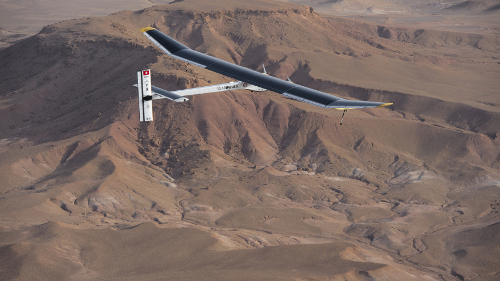
Have you heard of the Solar Impulse? It’s a Swiss aircraft that’s powered entirely by solar energy. The ambitious goal of this project is to fly around the world using only solar power. On May 1, they’ll begin a trip from San Francisco to New York City, with multiple stops along the way. They’ve already pulled off a 26 hour flight, as well as an inter-continental journey from Spain to Morocco, powered only by sunshine. (They use battery packs to store the spare energy and power the plane at night.)
When I first heard about this, I was kind of astonished that this is even possible. Are solar panels really sufficient to power an aircraft? And when can I expect to fly in one?
To find out how they managed to pull off this feat, let’s crunch some numbers.
How much power can you get from the sun?
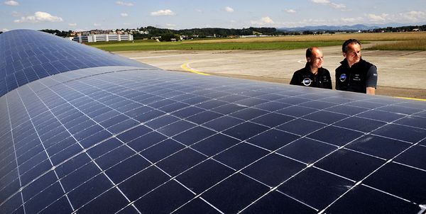
First, let’s work out how much power the plane captures from sunlight. The Solar Impulse has about the same wingspan as a 747 airplane, and its wings are covered in nearly 12,000 solar cells. That’s about 200 square meters of solar cells.
Solar Impulse
Now, the amount of power delivered by sunshine is a well known number. If you ignore clouds, and average over day and night, it comes to about 250 Watts delivered to every square meter of land. This number, 250 Watts/square meter is how much power we, sitting here on earth, can extract directly from the sun.
Put the two numbers together, and we get 250 Watts/square meter × 200 square meters = 50,000 Watts. This is the maximum amount of power that this airplane can theoretically capture from the sun, given its wingspan.
But we don’t have the technology to tap into all of this power. The best commercially available solar cells are about 20% efficient at capturing solar power, and then there are further losses in the batteries and the electric motors, all of which waste some power. Overall, the kind folks at Solar Impulse tell us that 12% of the incoming solar power is pumped out by the electric motors. That’s 12% of 50,000 Watts, leaving us with 6,000 Watts of useful power. Remember that number, we’ll come back to it.
The morning after a big snowstorm swept through the US northeast, I sat in my car, ready to brave hazardous road conditions and drive to the local coffee shop. My home in New Jersey was outside of the storm’s central path, so instead of piles of snow, we were greeted with a delightful wintry mix of sleet and freezing rain. And sitting in my car, I couldn’t help but be mesmerized by these strange patterns of ice particles forming on my windshield. Here’s what I saw:
As I watched this miniature world self-assemble on my windshield like an alien landscape, I wondered about the physics behind these patterns. I learned later that these patterns of ice are related to a rich and very active current area of research in math and physics known as universality. The key mathematical principles that belie these intricate patterns lead us to some unexpected places, such as coffee rings, growth patterns in bacterial colonies, and the wake of a flame as it burns through cigarette paper.
Wow. I’m really excited that Henry Reich, who’s behind the absolutely brilliant series of animated physics explainers Minute Physics, included me in his video list of “the most consistently awesome and creative science storytellers, explainers and teachers”. I got a chance to catch up with Henry at Science Online (more on that later), and it was really great to get his perspective on science communication, on physics explainers, and on the rapidly growing following that his work is amassing. Minute Physics recently crossed a *million* followers – it just blows my mind that a video series on physics can have that reach, and it speaks to Henry’s tremendous gifts as a smart, talented and funny science communicator. The traffic from Henry’s referral actually knocked my blog off the internet, and I had to frantically scramble to get things going again (too much love is a good kind of problem, in my book :).
Do check out the video. It includes many of my favorite places on the internet, including Radiolab‘s amazingly engrossing science storytelling and Sean Carroll‘s deliciously idea-dense blog.
In other shamelessly self-promoting news, I’m really floored to be listed in Byliner’s Best of Journalism list of 2012. It’s very cool for me to see this under-two-year-old blog included up there with so many mainstream journalistic organizations. I write this blog in my ever-dwindling free time, and do it for the love of writing and explaining science. It’s been a wild ride, and I’m excited to keep playing. Looking ahead, over the next few months I’m collaborating on a really fun blog-related experiment, so watch this space!